Link: http://photoshop-dragon.com/Tutorials/Text_Effects/Chrome_Text.htm
Website: Photoshop Dragon
Website: Photoshop Dragon

STEP 1
We'll start with the textured background we created in the Lined Background Tutorial. You might want to follow that tutorial first and then come back here to add the text and chrome effect. The lined background will make a very nice reflection effect in the chrome as we shall see. Here's our starting point:
We'll start with the textured background we created in the Lined Background Tutorial. You might want to follow that tutorial first and then come back here to add the text and chrome effect. The lined background will make a very nice reflection effect in the chrome as we shall see. Here's our starting point:

STEP 2
Now we'll add our text. I wanted a blocky looking oblique font, so I picked Serpentine-Medium Oblique and set the font size to 200 points. Choose white for the color and enter the desired text. Don't worry if yours didn't come out perfectly centered. We'll fix that in a moment.
Now we'll add our text. I wanted a blocky looking oblique font, so I picked Serpentine-Medium Oblique and set the font size to 200 points. Choose white for the color and enter the desired text. Don't worry if yours didn't come out perfectly centered. We'll fix that in a moment.

STEP 3
The first part here is optional. I include it just to give you some ideas for the options you can consider when working on a project like this.
I'd like my text to be a bit more angled than the font provides, so we'll fix that ourselves. We'll use the Distort transformation, but this transformation only works on pixel data, not text. So we first have to rasterize the text. Therefore, select Layer->Rasterize->Type. Then select Edit->Transform->Distort. Grab the middle handle on the upper edge and drag it a little ways to the right. I also raised it a little to increase the height just a bit as well. Stop when you get the look you want.
Now let's get things nice and centered. Make sure the layer containing the text is still selected and choose the Move Tool and use cmd-A to Select All (cntl-A on Windows). Now go to the toolbar and click the Align Vertical Centers button , then the Align Horizontal Centers button . Then Deselect (cmd-D on Mac OS or cntl-D on Windows).
Here's how mine ended up:

STEP 4
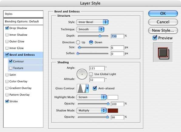
Layer Styles will give us the chrome look we want. Let's begin with Layer->Styles->Bevel and Emboss. Use these settings:
Layer Styles will give us the chrome look we want. Let's begin with Layer->Styles->Bevel and Emboss. Use these settings:
STEP 5
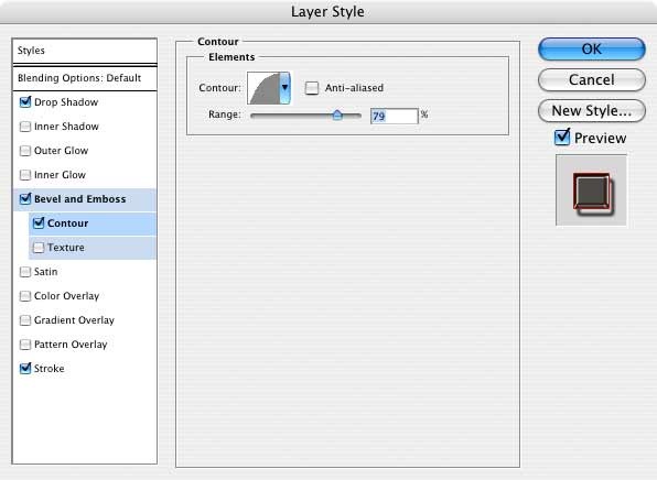
Now we'll add a Contour effect. The effect this gives is a matter of taste, but I like the way it flattens out the metal. To me it seems more like real chrome lettering
Now we'll add a Contour effect. The effect this gives is a matter of taste, but I like the way it flattens out the metal. To me it seems more like real chrome lettering
STEP 6
The Stroke Effect is next. The effect is subtle, but it adds a little more red around the edges to reinforce the reflection. Use a color that's similar to your background for the color. I used #b10000. Here are the settings:
The Stroke Effect is next. The effect is subtle, but it adds a little more red around the edges to reinforce the reflection. Use a color that's similar to your background for the color. I used #b10000. Here are the settings:

STEP 7
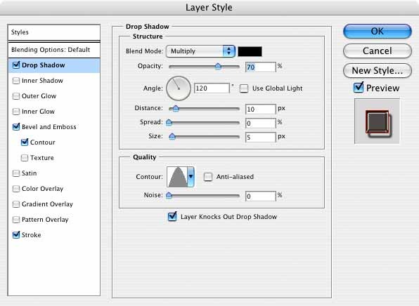
Lastly, we'll add a Drop Shadow. This is an important aspect to the overall effect:
These settings create a sort of optical illusion. When you apply these, you'll notice that there appears to be a reflection of the background on the right side edges of the text. This is pure illusion, but it's very effective. What's happening is that the Contour setting is causing a gap in the effect that lets the background show through between the text and the drop shadow. This makes you think it's a reflection, even though it really isn't. The trick is to keep the Spread at zero and the Size small. This makes it seem like the shadow is at the base of the raised lettering. You can make the letters appear to be taller or shorter by changing the Distance setting.
Here's what we have at this point: (Picture 7.1)

STEP 8
Let's plus this a bit further by adding a frame. We'll do this by using the Rounded Rectangle Tool to create a path. In the toolbar, make these selections for the settings:
First create a New Layer above the layer containing the text. Now draw out a nice rectangle around the text to form a frame. Don't worry if it isn't centered; we'll fix that in a moment. Just get it to be the right size for the text. Since you're just drawing a path, you'll only see a very thin line.

STEP 9
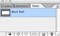
Now we'll color the path by using the Stroke Path function. Set the foreground color to white and select the Paint Brush tool . Pick a round brush and set the diameter of the brush to how ever thick you want the frame to be. I picked 21 pixels. Make sure the new layer is still selected. Now go to the Paths palette (pictured to the right) and make sure Work Path is selected. Go to the bottom of the palette and click on the Stroke Path button. This will use the paint brush to stroke around the entire path, leaving you with a nice rounded 21 pixel wide border.
Now we'll color the path by using the Stroke Path function. Set the foreground color to white and select the Paint Brush tool . Pick a round brush and set the diameter of the brush to how ever thick you want the frame to be. I picked 21 pixels. Make sure the new layer is still selected. Now go to the Paths palette (pictured to the right) and make sure Work Path is selected. Go to the bottom of the palette and click on the Stroke Path button. This will use the paint brush to stroke around the entire path, leaving you with a nice rounded 21 pixel wide border.
STEP 10
Time to center it. Choose the Move Tool and use cmd-A to Select All (cntl-A on Windows). Now go to the toolbar and click the Align Vertical Centers button , then the Align Horizontal Centers button . Then Deselect (cmd-D on Mac OS or cntl-D on Windows). Lastly, select Merge Down. When the frame is merged with the text layer, the layer style already in that layer will cause the effect to be applied to the frame, giving a nice looking chrome frame around the text to make a sort of license plate look. And here's our finished result:
Time to center it. Choose the Move Tool and use cmd-A to Select All (cntl-A on Windows). Now go to the toolbar and click the Align Vertical Centers button , then the Align Horizontal Centers button . Then Deselect (cmd-D on Mac OS or cntl-D on Windows). Lastly, select Merge Down. When the frame is merged with the text layer, the layer style already in that layer will cause the effect to be applied to the frame, giving a nice looking chrome frame around the text to make a sort of license plate look. And here's our finished result:

 RSS Feed
